Figures of technical analysis in trading, how to identify them, read them and their meaning. Figures of technical analysis will help you choose a suitable “point” for entering the company. What is it, what models exist and, no less important, what requirements are important to comply with so that their use in trading is effective? In this article, we will analyze the theoretical and practical foundations for reading and applying figures with examples on charts.
- Figures of technical analysis: what is it and what do they give in trading in the financial market
- What are technical analysis patterns for in stock trading?
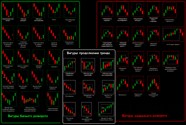
- What figures for the technical analysis of the financial market exist in trading – main and secondary
- Technical analysis patterns that reverse the trend
- Rules for working with reversal patterns in technical analysis
- Double/Triple Bottom and Top
- Diamond (diamond)
- Head and shoulders
- Patterns that continue the trend
- Ascending and descending triangle
- Rules for working with the “Triangle” technical analysis figure
- Pennant
- Flag
- Figures of uncertainty
- Converging triangle
- Wedge
- What is the difference between similar figures: flag and pennant
- Advantages and disadvantages of using figures for technical analysis of the financial market
- How to Use Patterns in Technical Analysis: Practical Examples
- Why You Can’t Completely Trust Technical Analysis by Patterns
Figures of technical analysis: what is it and what do they give in trading in the financial market
Patterns in trading (also called patterns and figures of technical analysis) are special combinations of
candlestick elements in a graphic display, interconnected by chart lines. Visual figures allow participants in exchange trading to analyze the current trend of the exchange and calculate the risks that are possible when entering a deal. Patterns will help:
- identify market conditions that are currently active and recognize which category of players dominates the stock exchange now – customers or traders;
- close failed transactions that have led to losses and teach you how to manage your risks correctly;
- identify the best entry points to the company.
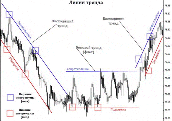
However, before looking for technical analysis patterns displayed on a trend chart, it is important to learn how to build three main lines of patterns:
- Baseline – support level . Everything is simple here: support levels are reinforced from two minimum price parameters (low points). When the current price of a financial asset approaches this line for the third time, it is likely to go up. The intersection of prices indicates that the current trend is coming to an end.
- The resistance level is the line opposite the support level. This is a horizontal line, upon reaching which the current price of the asset will decline. Thus, the support line is indicated by the “floor”, and the resistance line is indicated by the “ceiling”.
- trend levels. These lines are immediately responsible for the two levels described above, both in the ascending and in the descending financial market. If the price of the asset, determined by the seller or the buyer, increases, the trend level is built according to the minimum values, if it decreases, according to the maximum values.
- Patterns that continue the trend.
- Bilateral patterns.
- Reversal elements.
The first group shows that the trend that is currently active in the market can be continued, reversal elements will be some kind of warning – the trend is coming to an end and it is time for exchange traders to look for reversal points.
What are technical analysis patterns for in stock trading?
This technical tool for researching the financial market is in great demand among exchange traders due to its clarity, clarity and simplicity. Figures are especially in demand among beginners. Patterns are suitable for any type of graphic work: with bars, lines or candles.
Note! At first glance, the research tool is easy to use in practice, but, like many other methods, it requires certain skills and the ability to find and understand the meaning of the shapes that appear on the graphic image.
What figures for the technical analysis of the financial market exist in trading – main and secondary
All patterns used in the graphical analysis of the financial market, based on their properties and characteristics, are divided into several categories. There are only 3 such categories, we have already mentioned them above, but now we will consider in more detail:
- Patterns that reverse the trend.
- Patterns that continue the trend.
- figures of uncertainty.
Each category has its own rules, exceptions and progress. The general essence of the figures is simple: first they should be found on a graphical display, which will be quite difficult for new participants in exchange trading without experience.
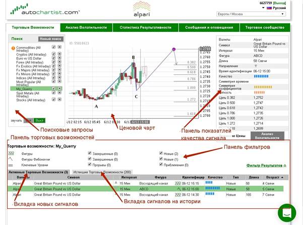
Note! For beginners, professional investors and traders recommend paying attention to the Autochartist service. This is a program that operates in automatic mode, analyzes graphic images and determines all the given patterns. Next, the application generates a forecast of the most likely development of events in the market.
Technical analysis patterns that reverse the trend
When an exchange trader finds any pattern of a reversal on a graphic image, he must understand that the direction of the trend will soon change or there will be some correction.
Rules for working with reversal patterns in technical analysis
In order for the pattern to bring a positive effect, it is important to comply with the following exchange requirements:
- It is important that the trend before the appearance of the figure is clear and formed. There is no need to look for reversal patterns during a period of insignificant movement of quotations that are not determined by a sharp jump or decrease in prices. Find similar patterns in sustainable trends.
- It is important that the trend formation time exceeds the pattern formation time.
These requirements cannot be neglected, they must be simultaneously observed on the graphical display of the price. If one of the conditions is not met, the likelihood that the sample will not play on the proper targets increases.
Interesting! The emergence of a trend can be determined not only through technical analysis using patterns. You can analyze the market and identify an unfolding trend using candlestick analysis (the most effective and popular method is Japanese candlesticks), as well as divergence.
The most popular patterns that signal an imminent trend change or correction are the double/triple top and bottom, diamond (rhombus), and head and shoulders.
Double/Triple Bottom and Top
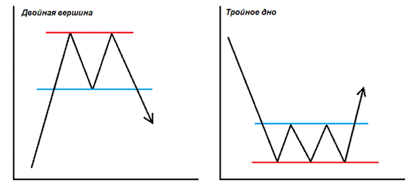
The “Double/Triple Top” pattern is an easy reversal pattern to recognize. It is formed near the resistance line and speaks of a situation on the stock exchange when the price does not have enough strength to break through this level several times in a row. This pattern is most often seen in an increasing market, when the forces of clients run out, their grip weakens and traders enter the fight.
Diamond (diamond)
This figure has the official name “Diamond”, but among themselves it is also called a diamond or a rhombus. It indicates an emerging trend.
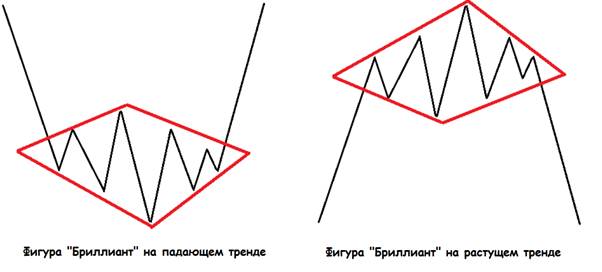
- Price line fluctuations are carried out inside a diverging triangle (in a graphical display, this area will be located on the left side of the diamond).
- Further, price fluctuations are reduced: the jumps become less sharp (you can notice this on the right side of the figure), after which the figure completely completes its formation.
The best time to make a trade against the exchange is when the diamond edge crosses up or down.
Head and shoulders
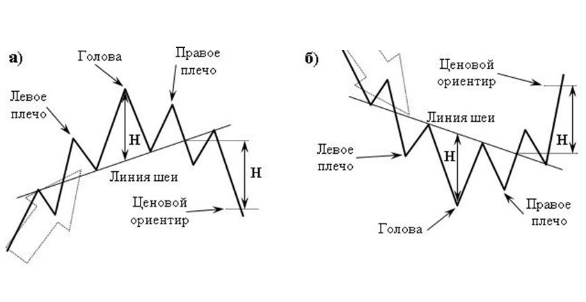
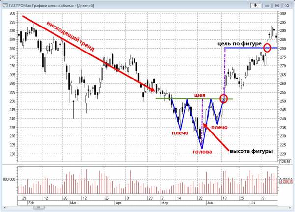
The Head and Shoulders pattern is another popular and most sought after technical market analysis pattern. The pattern includes the main indicator (head), from which two lower peaks depart from each side, forming some silhouette of the shoulders. In an ascending financial market, a standard pattern pattern is born, and in a descending financial market, an inverted one.

Patterns that continue the trend
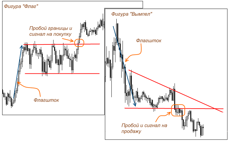
The appearance of these elements of technical analysis on the graphic image of the price line indicates to the investor or trader that after the pattern is crossed, the trend is likely to continue to gain momentum. There are only two main examples of technical analysis in this category: the flag and the pennant. The ascending and descending triangle pattern is less common. The essence of their work is the same for an uptrend and a downtrend, so the trading rules are identical. Trading rules for patterns that continue the trend:
- It is important that the trend direction before the pattern appears is stable and clear.
- The emerging pattern should be legible.
- The trader needs to break the pattern.
- After the “breakout” of the figure, you should trade exactly in the direction of the breakdown.
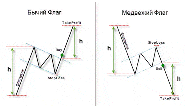
- Target values are determined by the size of the “pole” of the figure.
Ascending and descending triangle
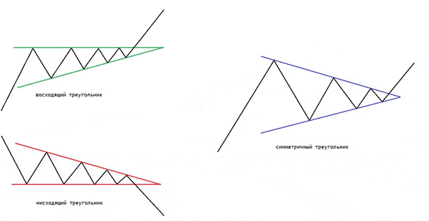
The triangle is the most common and well-known figure for traders, not only in the category of patterns that continue the trend. Combinations with its use are often used in trading: it is used on any timeframe and as a financial instrument. The sample makes it possible to determine the basic levels: resistance and support lines.
Rules for working with the “Triangle” technical analysis figure
The essence is simple: triangles are born in the process of trend correction and indicate the likely continuation of the current trend:
- To form this figure, a trader must find 4 or more points on the chart: two of them to build a trend line based on a larger number of candlestick elements, and two for the same purposes only for a minimum number of candlesticks.
- An ascending pattern is born with an increasing trend, a descending pattern, respectively, on a falling stock.
Note! The triangle formed on the side of the buyers indicates an imminent trend correction.
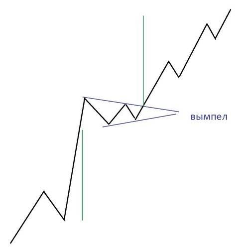
Pennant
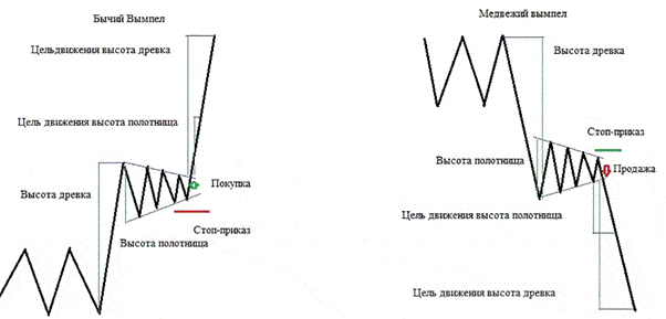
This pattern – the same triangle, differs only in the speed of formation – occurs within an hour. The appearance of this figure indicates a 100% continuation of the current trend.
Flag
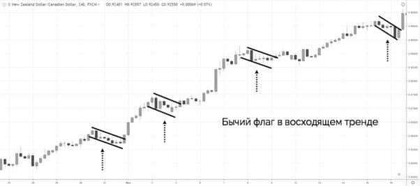
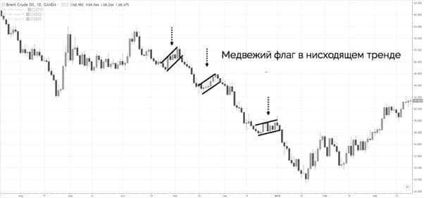
The “Flag” figure is depicted in the graphical figure in the form of a rectangle with parallel lines. The figure is born in the process of mutually identical arrangement of support and resistance lines.
Figures of uncertainty
This type of patterns can be found in any financial market: ascending, descending or sideways, and they appear several times more often than the above-described categories of patterns. As is the case with all types of technical analysis patterns, the rules for working with uncertain samples are the same: it is important to correctly identify the pattern and wait for it to “break through” the price in order to start a trade. Uncertain figures are also called bilateral, since it is not clear whether they indicate a change in trend or its continuation, it all depends on the direction of the price “breakout”.
Converging triangle
The main task of the converging triangle is to show the exchange trading participant the most advantageous direction in which to start a deal.
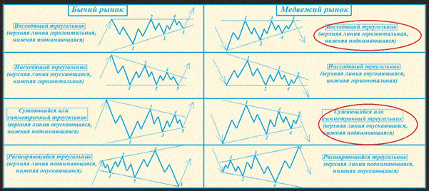
Note! The deal must be started in advance: if the trader expects growth, he should enter at the point when he rebounds from the support level, if there is a decline, after the rebound from the resistance line.
Wedge
If we consider the image of the figure itself, then in the graphic figure the wedge is almost identical to the pennant. The pattern includes the same components: a narrowing triangle in the form of a wedge and a certain “bayonet” that is responsible for the upward or downward price impulse.
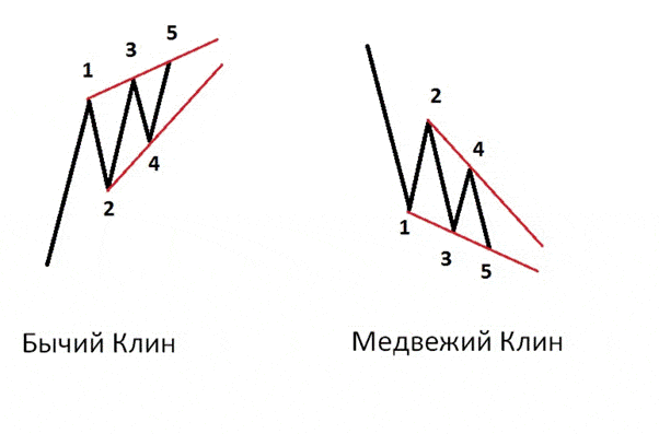
- Resurgent pattern. All dots assume an ascending position.
- Falling wedge. The situation is opposite – all points fall and take minimum values.
The most successful time to start a trade will be the period when the price line has not yet had time to reach the side opposite to the direction of the pattern.
What is the difference between similar figures: flag and pennant
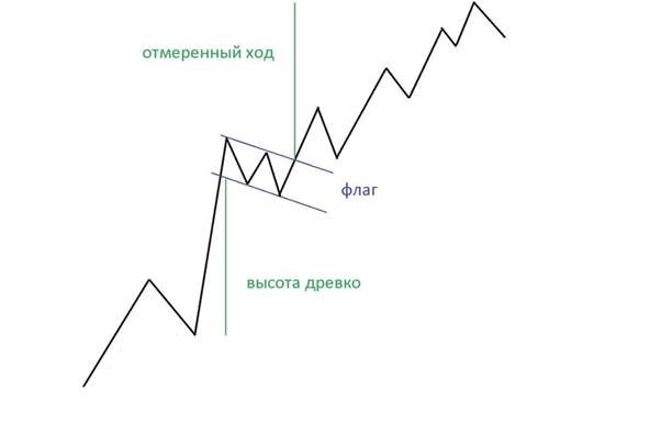
“Flag” is a pattern similar to a rectangle and its main difference from a pennant is that it is formed on a sharp, almost vertical movement, resembling a flagpole.
Advantages and disadvantages of using figures for technical analysis of the financial market
Technical analysis patterns will be effective and useful if a participant in exchange trading needs to quickly understand the essence of what is happening in the financial market, but it is important to remember that technical analysis by itself is not the most reliable and universal thing.
Note! You should not take courses and online lessons on trading if they are based only on technical analysis. This method is only a component of stock trading, it can be used as an additional tool, but in no case should it be used as the main and fundamental feature, because this is one of the most common mistakes of traders and investors, which entails increased risks and loss of profit .
The main disadvantage of technical analysis by patterns is that they do not take into account the main elementary factors, and hence the conclusion follows that the figures cannot provide truthful and clear information about the current situation in the financial market. However, samples are great as a financial tool for finding short-term rules that are hard to deduce based on the basic elements. It is also important for traders and, in principle, participants in exchange trading to pay attention to such a nuance of technical analysis by patterns – they can be both more effective and less effective. It depends on the situation prevailing in the financial market at the moment. Factors affecting the effectiveness of figures:
- Price spikes . When the price moves in an incomprehensible direction, the trader, as well as the figures, cannot know for sure how the price will behave and in which direction the next trend will be directed.
- Timeframe . The larger it is, the higher the interference that distorts the activity on the exchange. For this reason, patterns show clearer and more accurate results over long time frames.
Now let’s look at the positive aspects of technical analysis by figures and find out why this process is so loved by beginners in the financial market. Advantages:
- Ease of learning . Learning how to correctly interpret figures, find them and identify their purpose is easier and faster than understanding digital values, which are far from being subject to every experienced specialist. Therefore, even professional participants in exchange trading from time to time resort to technical analysis by patterns in order to speed up their work.
- Clarity . If you analyze the market and present the results to the public, then there is nowhere without a graphic display. The figures will clearly show and tell about the situation in the financial market.
- Speed .
- Scale . Technical analysis patterns show not only the state of the price, but also the psychology of the exchange, which allows the exchange trading participant to determine the patterns on the basis of which this type of analysis was formed.
How to Use Patterns in Technical Analysis: Practical Examples
Not every pattern is suitable for a certain situation prevailing in the financial market. A participant in exchange trading can have two formed figures, but only one of them can be suitable for entering the company. To increase your chances of a successful deal and entering the market, you should pay attention to the following nuances:
- trend;
- entry area;
- tight consolidation.
Remember! The trend is your friend, which will always lead to results! To get the maximum profit and not burn out in the transaction, you must always trade on the current trend.
A bullish flag can be used as an entry point to a financial market with an uptrend:
Bar 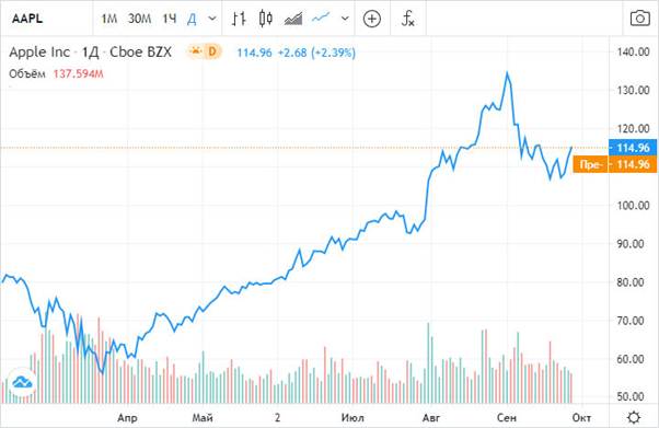
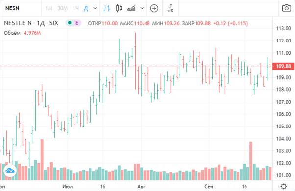
Chart 
Why You Can’t Completely Trust Technical Analysis by Patterns
As we found out above, technical analysis by figures is not effective in every case and certainly will not work in the long run as the main financial instrument. The effectiveness of figures and patterns has not been proven, their effectiveness is proved only by some luck that comes in the process of trading with traders and investors. It is possible to make a good profit with the help of a pattern, but only if the participant in the exchange trade is well versed in the aspects of the exchange and can determine the movement of the trend. However, having determined the trend, the figures will not become the most significant part of trading, since here profit can be made already with the help of intuition or indicators.
