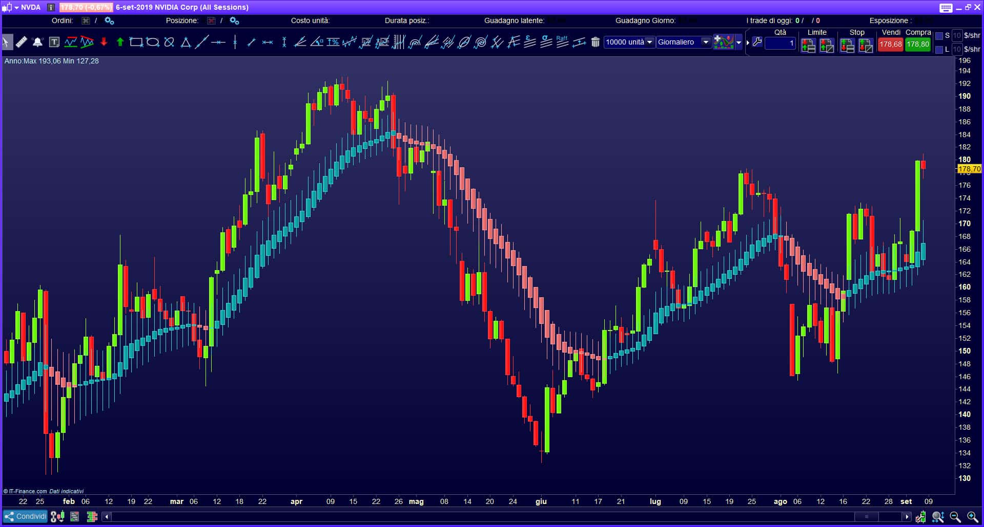
The main element of trading is charts that display prices over time. At first glance, the charts may seem like ordinary unsystematic broken lines, without any dependence, and price fluctuations are random, but they are not. Analyzing charts both manually and with the help of special technical tools based on the principles of mathematical statistics and analysis, it is possible to identify hidden patterns in price changes, trends in their change, and predict with high probability how prices on the stock exchange will change in the next moment, which allows you to make profitable transactions.
- Flag
- How to trade on the “flag”
- Pennant
- Bullish pennant trading
- Bearish pennant trading
- Wedge
- Rising wedge trading.
- Trading in a falling wedge
- Triangle
- Types depending on the shape of the figure
- How to trade
- bullish rectangle
- Trading Methods for a Bullish Rectangle
- First method
- Second method
- How to set the profit level
- Conclusion
Flag
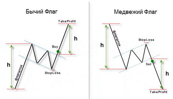
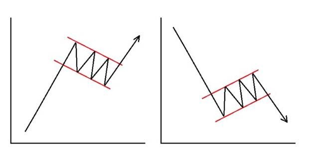
How to trade on the “flag”
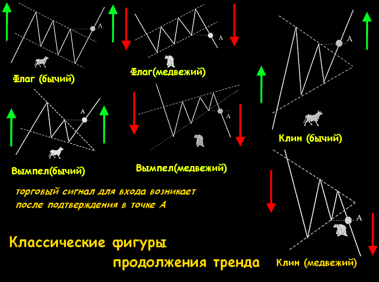
The direction in which the trend is going is determined, so it is necessary to focus only on the quantitative factor of the price. The price target after the pattern has formed can be calculated by determining the height of the flagpole. It is also worth considering that the maximum size of the flag itself usually does not exceed five zigzags, after which, on the fifth, the price goes beyond the figure. 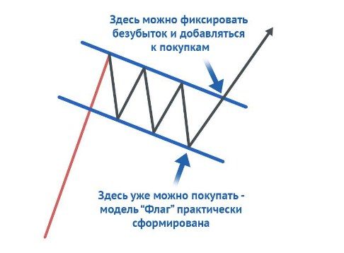
Pennant
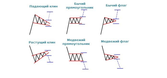
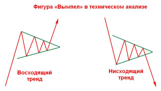
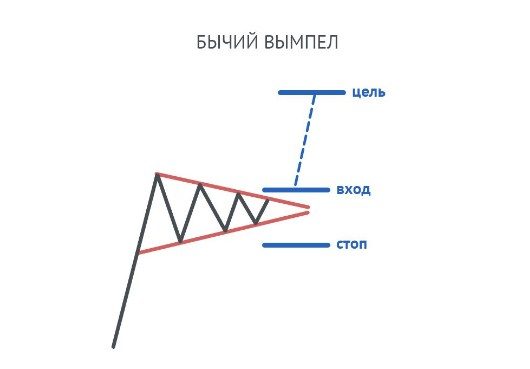
It looks like a flag, but with one difference: in the “flag” the waves are limited by the shape of a rectangle, that is, the channel, and in the pennant – in the shape of a triangle, narrowing the height of oscillations in the opposite direction from the flagpole. The second difference is that the range in which the pennant moves is narrower than that of the flag, and the price increase in front of it is almost perpendicular. Also, this figure has one remarkable feature: a short time for which it is formed. There are two types of this pattern: a bullish pennant and a bearish pennant.
Bullish pennant trading
At the moment when the price is above the upper level of the formed triangle, you need to open a buy position. Stop loss must be placed below the lower line. Take profit must be set to the length of the flagpole.
Bearish pennant trading
When the price exceeds the lower level of the formed pennant, you need to open a sell position, then set a stop loss beyond the upper line and then set a take profit for a length equal to the length of the flagpole [caption id="attachment_14817" align="aligncenter" width ="530"]
Wedge
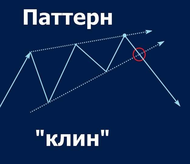
It is built after a sharp price change, while a figure resembling a pennant is formed, but with the difference that the triangle that forms the fluctuations is not completely formed. This element has a slope in the direction opposite to the trend.
Rising wedge trading.
It is worth starting trading after the lower line of the wedge, also called “Support”, is broken. Then it is necessary to expose the position for sale. Place your stop loss above “resistance”. In this case, the take profit must be greater than the size of the figure. 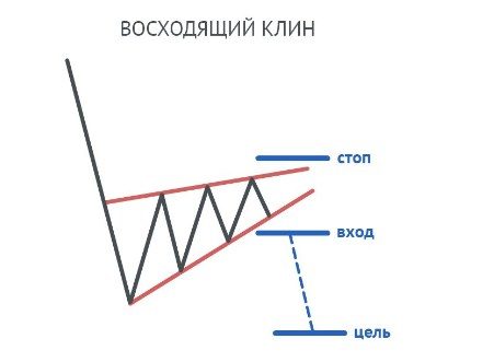
Trading in a falling wedge
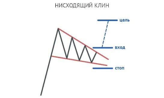
After the price has broken through the upper line, we enter the market. We set a take profit larger than the wedge size and place a stop loss below the lower line.
Triangle
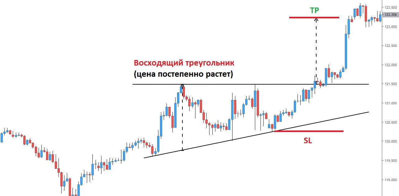
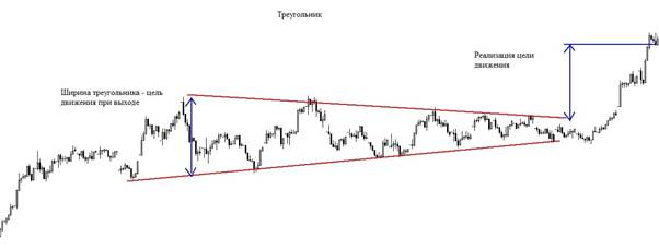
The triangle looks like zigzag fluctuations within a contour shaped like a triangle. In most cases, it is formed at the end of the main trend. Triangles differ in shape type and signal strength.
Types depending on the shape of the figure
In ascending triangles, the axis of symmetry has a positive slope. In descending triangles, the axis of symmetry has a negative slope. For symmetrical triangles, the axis of symmetry is parallel to the time axis, that is, it has no slope. A symmetrical triangle is a strong trend continuation indicator. 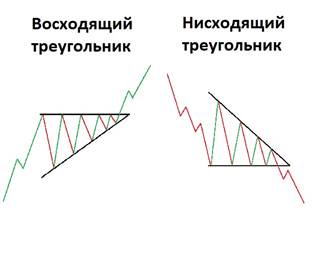
How to trade
The way to trade the triangle depends on the prevailing trend. In the event that an ascending triangle appears on a bearish trend, or a descending triangle on a bullish one, then the trend will have low strength. Then one triangle is not enough to understand that the trend will continue. And vice versa: a strong signal appears with an ascending triangle on a bullish trend and a downward one on a bearish one. The same patterns are known that were seen in other figures:
- If there are more than five waves, the price will most likely rise faster after the breakout.
- The earlier the breakout occurs, the stronger the trend.
Also, as with the previous figures, it is better to trade on triangles only when a price breakout has been confirmed.
bullish rectangle
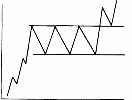
A bullish rectangle is a trend continuation pattern that is formed at the moment when there is a pause in the price change during a strong uptrend, and also oscillates for a while without going beyond the parallel lines – indicating the limit of fluctuations. 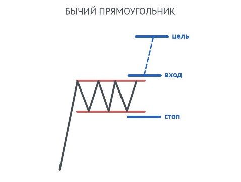
Trading Methods for a Bullish Rectangle
First method
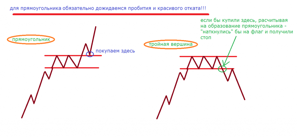
Opening a deal. It is necessary to enter the market immediately after the candle closes above the upper limit, the resistance line. That is, you should place a buy position if the deal is long. Stop loss should be placed just below the support level, which is indicated by the lower line on the chart. You need to set the profit level as follows: take the height of the figure and set the profit level at the same distance above the resistance level (upper line).
Second method
The algorithm of actions begins in the same way as in the first method – you must first wait until the candle closes at the resistance level, breaking it. Then you need to open a buy order at the moment when the price falls to the resistance level and starts to grow again (at this moment the resistance line turns into a support line for the new rectangle figure). Stop loss should be placed slightly below the resistance line (new).
How to set the profit level
Just like in the first method, it is necessary to set the profit level at the distance of the figure height above the resistance level. 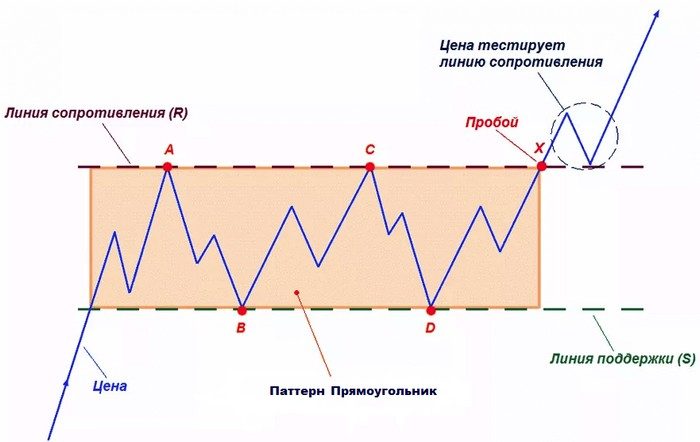
Conclusion
Although the search and subsequent trading using the above patterns is not an exact science, but only belongs to the statistical area of \u200b\u200bmathematics, which gives only approximate forecasts of price changes, it is still worth practicing in identifying them, since this way you will find patterns much more often, and Knowing what they mean will help you make correct predictions and get the most value from trades with the highest probability and the least risk. Moreover, these figures can serve not only as trend continuation signals, but also show price targets, which is also important for a trader who approaches business rationally and thoughtfully. Ultimately, the use of these figures, statistically brings more benefits.
